Fiat — Usability Test & Redesign
A usability study of Fiat Türkiye's website, delivered to Fiat, followed by a self-initiated redesign with a live, coded design system.
- Phase 1 role
- UX Researcher (client project)
- Phase 2 role
- UX/UI Designer (self-initiated)
- Team
- 1 Research Manager, 2 UX Researchers (incl. me)
- Timeline
- January – March 2026
Tools · Figma · React, Vite, JSX · GitHub, Netlify · Google Analytics, Microsoft Clarity, Airtable
Research
Millions of visitors. Almost no leads.
Most traffic is mobile and comes from paid campaigns. We checked how well the site turns it into leads.
- 1Campaign pages didn't match the ads that brought users in.
- 2Prices, versions and specs were hard to reach.
- 3The lead form made users re-select the model they were viewing.
- 4Most visitors left before becoming a lead.
- Ran the heuristic evaluation and the user flow & competitor analysis.
- Moderated 7 of the 14 usability sessions.
- Co-analyzed the results and co-wrote the findings.
- Audited Fiat's global sites and delivered template-based mid-fi wireframes.
- 83prioritized usability-test findings
- Designrecommendations
- Mid-fitemplate-based wireframes
Phase 1 ended with design recommendations and mid-fidelity wireframes for the electric and commercial vehicle pages, delivered to Fiat.
Self-initiated redesign
An independent concept built on the Phase 1 findings. Not commissioned by or presented to Fiat.
Why electric vehicle buyers?
EV buyers weigh the most factors before deciding, yet the EV experience was one of the most neglected areas of the site.
| EV buyers need | On the site, it was |
|---|---|
| Range, charging, battery | Buried in specs or missing |
| Home charging time | Not shown |
| Savings calculator | In “Electric World”, not the car page |
| Battery warranty | Not on the car page |
| What the car can do | Screen images, not capabilities |
| EV services (E-Plus) | Hidden under after-sales |
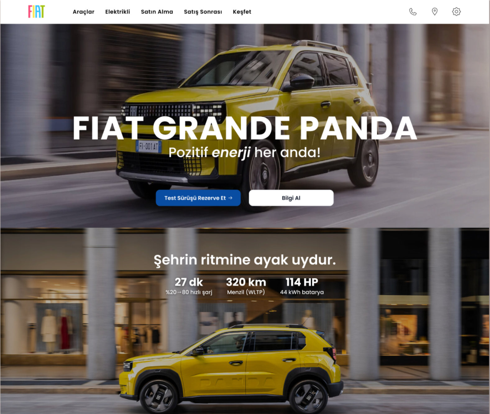
Put the EV essentials and the next step in the first view
- ObservedRange, charging and battery info was buried in PDFs or missing.
- InsightIf it's not up front, buyers leave to look elsewhere.
- ChangedA spec strip under the hero, with “Book a Test Drive” and “Get Info”.
- Trade-offWarranty and cost of ownership only after scrolling.
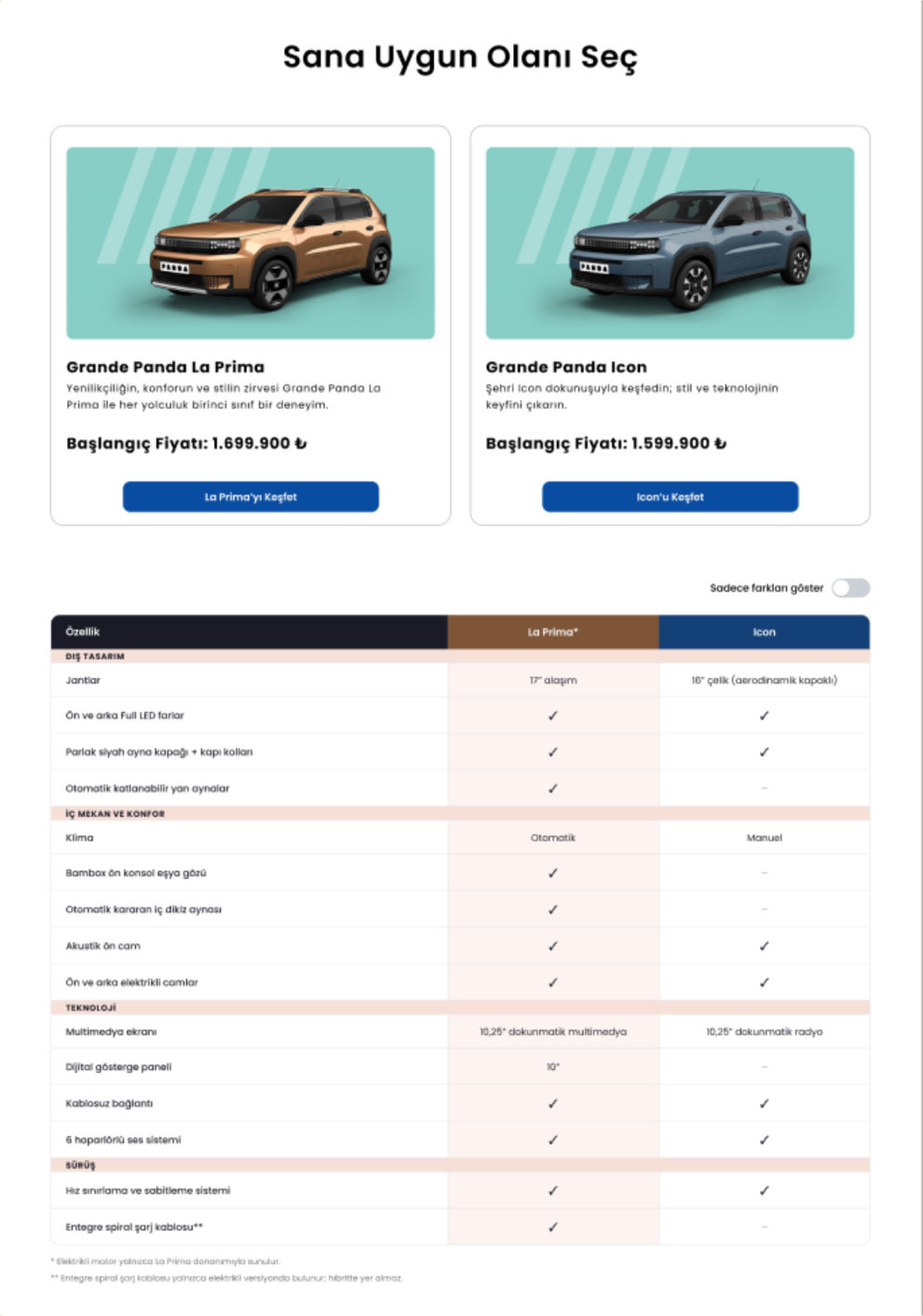
Make version differences visible at a glance
- ObservedUsers couldn't tell versions apart. Some would ask AI to compare.
- InsightComparison is central to buying a car.
- ChangedVersion cards with prices + a table with a “Show differences only” toggle.
- Why not a chatbot?A static table is transparent, fast to scan, and needs no new system.
- Trade-offCompares Fiat's own versions only, not other brands.
Bring the cost question onto the car page
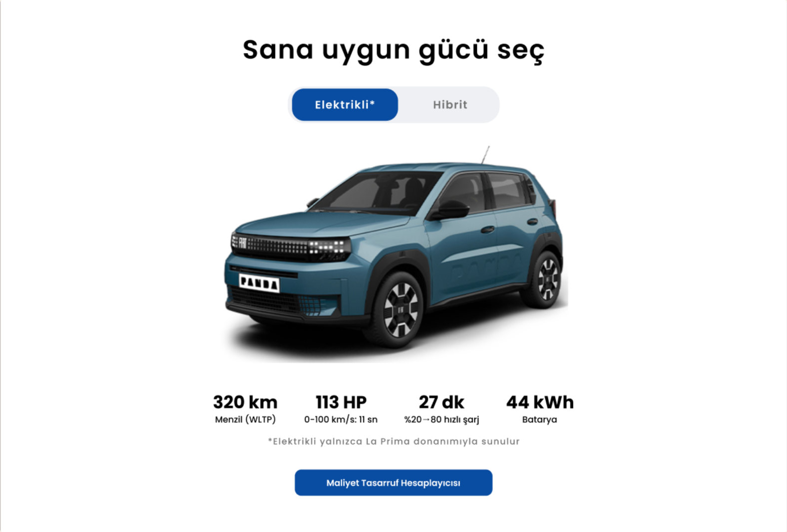
- ObservedNo one found the savings calculator alone. They expected it on the car page.
- InsightFor EV buyers, “Is it worth it?” is part of the product decision.
- ChangedAn Electric / Hybrid toggle that updates specs, with the calculator right below.
- Trade-offThe calculator stays one click away, to keep the focus on choosing.
Within the system, and beyond it
Fiat's local sites must match its global ones, so pages are assembled from existing templates. I designed one version inside those limits, and one without them.
| Within Fiat's templates | Without constraints | |
|---|---|---|
| Layout | Fiat global templates | Designed from scratch |
| Hero | Photo, specs, price, powertrains | Full-bleed with CTAs, specs band |
| Navigation | Sticky in-page nav | Simplified menu, sections in order |
| Comparison | Equipment lists per version | Side-by-side table + toggle |
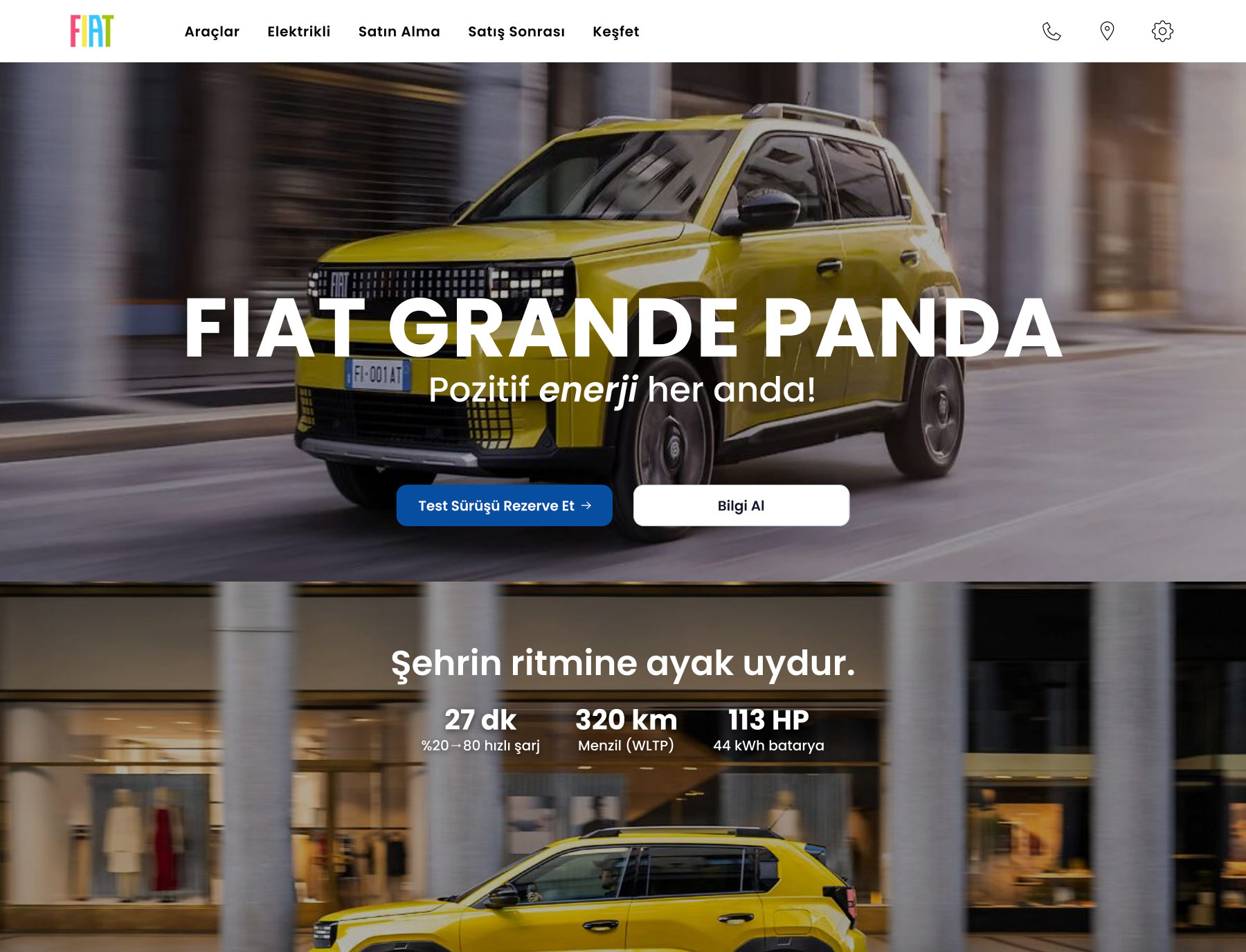
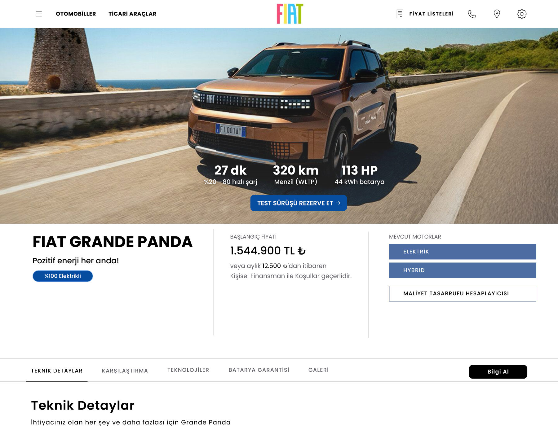
Interactive prototypes, web and mobile
A live, coded design system
I turned the redesign's foundations and components into React. With little coding experience, it was my way to see how design decisions become code.
- Foundations
- Color, radius, type tokens · one tokens file
- Components
- Button (type × size × state), Segmented Control, Switch, Color Swatch
- Stack
- React · Vite · GitHub · Netlify